Statistics is a field that you will use throughout your academic and professional career; it is a mathematical area extensively used throughout the professional world. You will never have to ask yourself (or your professor), "when am I going to use this knowledge?". Nope, that's not happening in the professional field, especially when the corporate sector uses statistics and graphical representations.
It is a necessary part of business presentations and helps businesses analyse their profit/loss per cent. A graph is one of humanity's most useful discoveries as it can display vast amounts of computational information into diagrams that are easy to understand. Graphical representations save time and make the planning process swiffer.
A statistician is a professional that implies
statistical, computational techniques and practical
methods to generate models for real-world circumstances.
They collect, calculate, and interpret data to help various
businesses make decisions.
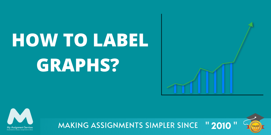
Since the first year of high school, students have learned all about the various types of graphs and the formulae used in the computational process of composing a graph. Yet, many of them find it difficult to interpret one and have no idea how to label a graph properly. Such circumstances can happen in real life as it is still a part of mathematics, and maths is one of the least interesting subjects according to popular beliefs.
Interesting or not, it's still the most useful concept that you will eventually have to get a hold of as you will need in your professional life. Management, finance, accounting, environmental studies, nursing, and almost all academic courses use graphs. So you don't need to fret as this is your guide to the 123s to label various types of graphs. Read forth to learn how to label graphs.
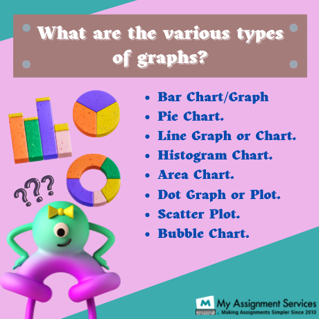
What Are the Five Prominently Used Graphs?
Various types of graphs are used, and majorly, it depends on the data type and range that determines the appropriate type of graph for a given data. A bar graph is the most common type of graphical diagram used by high school students and research institutions. Yet various types of graphical illustration will make the data representation easier to interpret. Five of the most extensively used graphs are:
Bar Graph
As you can interpret from the name, it is a graphical representation where various bars represent the density, range and target points of a given data. Such graph types are pretty common, and most people know how to read one. But, bar graphs can be confusing if the given data has variables in it.
Pie Chart
A pie chart is yet another commonly used graphical diagram. It is (as the name suggests) shaped like a pie that is divided into various pieces and the different sections represent distinct data ranges. Similar to a bar graph, a pie chart cannot be used for data with two or more variables; only absolute values or percentages can be represented on a pie chart.
Doughnut Chart
Okay, this is the third one, and yes, again, as you can already guess, a doughnut chart is shaped like a doughnut. It is sort of similar to a pie chart, and the only difference is that a doughnut chart represents the total percent/number in the middle of the diagram. The shortcoming is still similar to a pie chart; variable data cannot be represented in a doughnut chart.
If you're wondering why it is used, then? The usage of a pie chart and a doughnut chart depends on the audience. A doughnut chart is used for audiences interested in knowing the net figure of the data, and there are many of them; hence a doughnut chart is also commonly used.
Tip: Don't use 3-D effects on your graphical
diagram as a person with a lower mathematical
comprehension may not understand it well.
Line Graph
A line graph is a form of graphical representation where many lines represent the variation of the different entities in a data. The lines drawn on the graphical plane usually represent variables in data and how such variables are changing depending on the other entities in the data.
In the corporate world, a line chart represents the sale, profit/losses, revenues and other variables in an organisation. The data represented through a line graph is usually huge data compiled over time, and a line graph helps in easily interpreting such extensive data.
Learn how to acknowledge any source of information using the APA 7th style.
Download Now
Area Chart
It is similar to a line graph representing different variables over time. The only difference is that an area chart represents the whole and the variables altogether. The entire graphical plane represents the net figure of the data, and the different area zones represent the variables.
These are the five most prominently used graphs, especially in the corporate world. A business report can commonly see graphs with constant data points like bar graphs, pie charts, and doughnut charts. The constants and the variables greatly impact the type of graphs to be used for data. Now, we've learned about the types of graphs that are prominently used, so we can move forth to learn how to label graphs in the x-y plane.

Additional Tips for Labelling Graphs
Graphs represent a huge amount of data in an easily comprehensible format. Years of the progress of a business, millions of people's preferences, and climate change can be understood from a graphical diagram; how amazing is that? We can also represent small ranged or variable data on a graph, yet none of it would make sense without correct labelling. The graphs with constant values are easier to label and understand, but the data with variables may require computational inputs to interpret data into constants. Here's how you label a graph in the XY plane.
The intersection point of the x and y-axis is called the origin or 'o'. There are usually two sets of entities, or maybe more, when we get a set of data, yet the deciding factor here is the independent or dependent variable. For example, when data represents a business's progress through the years, say 2010-2020, the years here are the independent variable as they remain constant and unchangeable. In contrast, the profit/loss percentages of the business are the dependent variable that gets influenced by various factors.
Graphs were discovered by Leonhard Euler,
a Swiss mathematician and the first statistician.
He solved the Königsberg bridge problem using
graphical diagrams and discovered graphs in 1735.
Labelling
The horizontal line that you see on a graphical plane is called the x-axis. Similarly, the horizontal line is the y-axis. When choosing the axis line for the variables, we must consider the dependency of each data set. The independent data points are defined on the x-axis, and the dependent variable is placed on the y-axis.
Scaling
When choosing the scale for the graph, the same basic idea of the dependency of the variable comes into play. The independent variable can be represented as the given data point as it is usually less in number when compared to the dependent variable. The dependent data set might have a range in the data than specified data points. The scale of both the axes must be equally distributed; the difference between each successive data point must be equal.
For the example we chose previously, the years 2010-2020 will be represented on the x-axis using a scale of one-two year gaps, i.e. 2010, 2012, 2014, 2016, 2018, 2020. The labelling on the y-axis will be of the company's profit per cent and the scaling be of 5-10 per cent gaps in successive data points which are 10%, 20%, 30%, and so on.
So here it is; finally, you know a graphical representation's labelling and scaling procedure. The interpretation of the graphs is also done using the same information. The independent and the dependent variable, the scaling and the data points will help the reader understand it better with proper scaling and labelling. Should you have any questions
Final Tips Before You Get Practising
Now that you know how to label graphs? Heed the range and the distribution to label the graph correctly. The data points are distributed over a huge range when the data is exhaustive. In such cases labelling the y-axis can get a little tricky, so we use a king to represent the compression of data points.
You must never forget to mention the data set you represent on a particular axis. If the x-axis represents years, we write 'years or time' below the axis. Do similarly for the y-axis.
Also, mention the scale chosen for each axis and what each data point on the respective axis represents. Follow the above mentioned method to label your graphs accurately and heed the tips to achieve a well-labelled graph. Keep practising as it might take some time to get a hold of it.

Related Study Materials
Our Experts can answer your Assignment questions instantly.
Ask QuestionAbout the Author

RELATED POSTS


0 Comment
Get It Done! Today
1,212,718Orders
4.9/5Rating
5,063Experts


Loved reading this Blog? Share your valuable thoughts in the comment section.
Add comment