- Subject Code : ISYS3375
- University : RMIT University My Assignment Services is not sponsored or endorsed by this college or university.
- Subject Name : Busincess Analytics and Statistics
Case 1: AuCement
In order to research about customer satisfaction on new cement product manufactured by the company and sold across Sydney, Brisbane, Canberra and Melbourne, descriptive statistical method will provide relevant results.
-
Payment Type
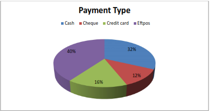
Figure 1. Payment type
The payment type analysed via pie chart demonstration, from the 50 receipts collected shows that a greater number of customers favour Eftpos over rest of the payment options. There are only 32% customers who prefer to make cash payments while least percentage of customers has used cheques for completing the transaction. With this pie chart interpretation, it is indicated that customers in Australia are highly inclined towards using electronic means of payment and are regular users of credit and debit cards for transacting generally. The cash payments have not lost their utility entirely across Australian cities but as far as primary preference is concerned, electronic funds transfer is widely preferred.
-
Customer’s City
The bar chart displayed in figure 2 reveals the frequency of customers belonging to the chosen four cities of Australia. It is observed that the majority of customers come from Sydney followed by Melbourne. The lowest number of customers are from Canberra the capital city but when observed from inter group variations, there are minor differences which makes the selected sample of respondents for this research as homogenous. It also gives an impression that highest number of buyers for product of Au Cement come from Sydney that indicates the popularity of this new product variety in the city to be most in comparison to the rest of the cities of Brisbane, Canberra and Melbourne.
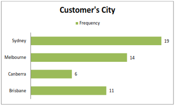
Figure 2. Customer’s City
-
Relationship Between Customer Satisfaction and Delivery Time
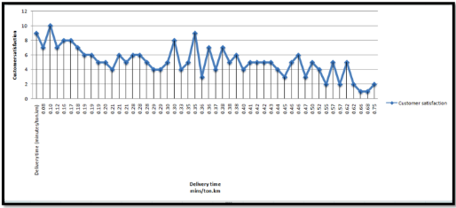
Figure 3. Customer satisfaction and delivery time
The plot presented in figure 3 depicts the relationship between customer satisfaction score from the new product of Au Cement based upon the delivery time in minutes/ton.km. The customer satisfaction score ranges between 0-10 for the current sample of customers and it is visible from the graph that the customers have given higher scores for delivery received by them in lesser time duration for the product. The highest satisfaction score of 10 points is given by a customer for a delivery received in only 0.10 min/ton.km. Later, a decreasing trend post this score can be observed as the duration of delivery time increases until the spikes are observed yet again for satisfaction scores 8 and 9 for corresponding delivery duration of 0.30 min and 0.35 min respectively. For the rest of the data increase in customer satisfaction ratings are visible with a rise and dip observation in which a constant customer satisfaction score of 5 is also observed for delivery received by customers in an interval of 0.41-0.43 min. However, due to lack of any definite trend observation throughout the data, it is not safe to assume at this stage that delivery time has a stringent impact on customer satisfaction. At the same time, the importance of this factor cannot be ignored altogether with reference to customer satisfaction from the new product’s delivery service.
-
Relationship Between Customer Satisfaction and Sale Price
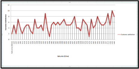
Figure 4. Customer Satisfaction and sale price ($/ton)
With reference to figure 4, relationship between customer satisfaction and sale price is observed with several peaks in the graph and no definite trend. This leads to the inference that there is clear association between the price of new product and customer satisfaction. It further implies that the company does not need to focus on any particular pricing strategies in relation to launching of this new product in the market as any direct impact of former on the customer’s satisfaction level is not evident. For instance, the highest satisfaction score of 10 is observed at a price of 435 $/ton which is a very high price so it is takes to the consideration that customers across the chosen Australian cities might decipher higher priced product with a mark of quality and therefore multiple peaks for satisfaction scores can be seen as the sale price increases. However, the lowest satisfaction score of “1” is given by a customer for a sale price of 374 $/ton which leads to the conclusion that there are reasons apart from seemingly relevant association of price and customer satisfaction.
The table displayed below shows the mean sale price for new cement product as 356.74 $/ton and wide differences between the values of central tendency measures namely, mean, median and mode suggest the distribution of data is asymmetrical (LeBlanc 2004). The standards deviation of 38.59 explains the degree of variability within the data while the skewness value within -1 to 1 implies that data is not highly skewed. The maximum sale price is recorded to be 469 $/ton while its lowest value is seen as 297 $/ton.
|
TABLE 1. Sale price ($/ton) |
|
|
Mean |
356.74 |
|
Standard Error |
5.45787654 |
|
Median |
349.5 |
|
Mode |
297 |
|
Standard Deviation |
38.59301512 |
|
Sample Variance |
1489.420816 |
|
Kurtosis |
0.574102754 |
|
Skewness |
0.801212136 |
|
Range |
172 |
|
Minimum |
297 |
|
Maximum |
469 |
|
Sum |
17837 |
|
Count |
50 |
Case 2: Ambulance Victoria
-
LGA Category and Customer Ratings
The performance on the basis of response time target for Ambulance Victoria is evaluated with the help of descriptive statistical analysis from the secondary information collected during the third quarter for 2015-2016 (Data Vic 2016).
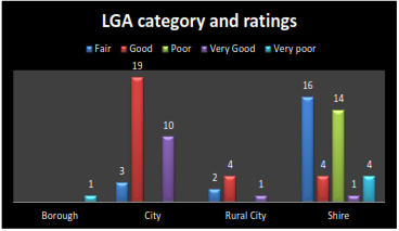
Figure 5. LGA category and customer ratings
The graph presented in figure 5 shows the different local government categories classified for different levels of satisfaction of customers for the ambulance service. The highest count of satisfaction level “good” is achieved from city followed by “fair” satisfaction level noted for the shire area. In the Borough area, satisfaction level is very poor indicating unacceptable level of quality of the ambulance service. As for “very good” level, city, rural side and shire areas have shown affirmation but the frequency is low. Overall, improvement in service quality is required in all areas except city particularly in the Borough category.
-
Number of Incidents
The following table describes the summary statistics for the total number of accidents recorded for the third quarter of 2015-2016. The average number of accidents recorded for this period is approximately 1365 wherein minimum number of accidents occurred were 142 while, maximum were reported to be 2903. The level of skewness is low for the data however distribution of data is uneven and the higher value of standard deviation indicates more variability in the data.
|
TABLE 2. Number of incidents |
|
|
Mean |
1364.797468 |
|
Standard Error |
90.43509525 |
|
Median |
1193 |
|
Mode |
#N/A |
|
Standard Deviation |
803.8047087 |
|
Sample Variance |
646102.0097 |
|
Kurtosis |
-1.197386246 |
|
Skewness |
0.326907498 |
|
Range |
2761 |
|
Minimum |
142 |
|
Maximum |
2903 |
|
Sum |
107819 |
|
Count |
79 |
-
LGA Category and Number of Incidents
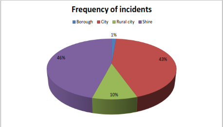
Figure 6. LGA Category and frequency of incidents
The pie chart displayed in figure 6 demonstrates the frequency of incidents that have occurred which is an important information for Ambulance Victoria to curate its services accordingly. Based on the pie chart, Shire tops in number of incidents with 46% of total incidents belonging to this area followed by city while Borough stands on the last position. It is inferred from this demonstration that Shire and city areas will most likely present greater rate of demand for the ambulance services and accordingly, Ambulance Victoria must ensure the service availability for the emergency in future.
-
Average Response Time in Different LGA Categories
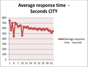
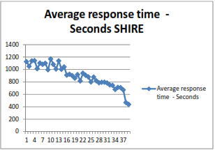
Figure 7. Average response time (seconds) for City and Shire areas
Based on the evidence that maximum number of services have been operated in city and shire areas, an assessment of their average response time is performed. The line graph depicts the average response time for city and shire in figure 7. The average response time plotted for the city area shown in figure 7 reveals that the after certain peaks in the beginning and a sharp dip noticed at two points, 449 and 463 seconds of average response time is noticed. After that a decreasing trend in the later part of the plot is observed which leads to the inference that average response time has decreased implying a better service offering the city area. On comparing the city’s average response time with that of Shire, there are lesser peaks and troughs revealing that variation in service timing of Ambulance Victoria is much lesser in Shire when compared with the city. Furthermore, there is sharp decline in average response time for Shire as seen from the later half of the plot which overall projects that Shire has received not only the highest number of services but also at a good quality with reference to lower values of average response time.
-
Customer Rating and Response Time
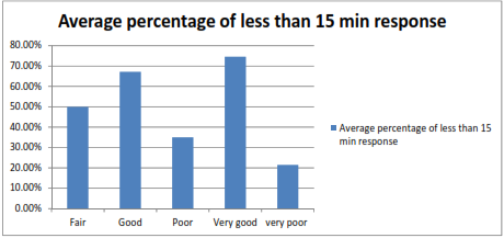
Figure 8. Rating and response time
The graph displayed in figure 8 shows the classification of customer ratings for the services as per the percentage of less than 15 minute response which has been averaged for all services availed across different local government categories. The highest average is observed for the “very good” category which is more than 70% followed by “good” which is approximately 67%. The average percentage of less than 15 minute response when observed with respect to customer rating informs that majority of the people are satisfied from the service as far as service response timing is concerned. Therefore, service quality is rated well in terms of timing and with frequency of incidents increasing, it is likely that Ambulance Victoria will come across more opportunities to further improve the satisfaction level of customers.
References
Data Vic 2016, Datasets, viewed 31 May 2020, https://www.data.vic.gov.au/data/dataset/ambulance-victoria-lga-response-time-performance-quarterly>
LeBlanc, DC 2004, Statistics: Concepts and applications for science, Jones & Bartlett Learning, Massachusetts.
Remember, at the center of any academic work, lies clarity and evidence. Should you need further assistance, do look up to our Business Analytics Assignment Help
Get It Done! Today
1,212,718Orders
4.9/5Rating
5,063Experts

Highlights
- 21 Step Quality Check
- 2000+ Ph.D Experts
- Live Expert Sessions
- Dedicated App
- Earn while you Learn with us
- Confidentiality Agreement
- Money Back Guarantee
- Customer Feedback
Just Pay for your Assignment
Turnitin Report
$10.00Proofreading and Editing
$9.00Per PageConsultation with Expert
$35.00Per HourLive Session 1-on-1
$40.00Per 30 min.Quality Check
$25.00Total
Free- Let's Start


