- Subject Code : MIS770
- University : Deakin University My Assignment Services is not sponsored or endorsed by this college or university.
- Subject Name : Data analytics
Assessment
PART 1:
Criteria 1: Single Summary table
A single summary table provides a summary of the statistical data in table format, where the rows define the data of single variable, whereas, and the column defines the frequency or percentage of each distinguished variable. The statistical data presented in this type of table is of a single variable.
Criteria 2: Pie charts
Pie charts are the graphical representation of the data in a circle, where the circle is divided into different variables based on the percentage and the arc length of each variable.
Criteria 3: Bar graph
The data in a bar graph is represented in rectangular bars, where the frequency of each variable is defined by the height and breadth of the rectangle is equal and defines the variable. The Bar graph can be vertical or horizontal.
Criteria 4: Histogram
The histograms are graphical representations of the statistical data, where the area of the rectangle defines the frequency and the width of the rectangle defines the class interval.
Criteria 5: Clustered Bar chart
Clustered bar chart showcases more than one data series in vertical rectangles. Each data series is demonstrated on same axis labels and vertical bars are grouped based on categories.
Criteria 6: Stacked Bar chart
The stacked bar chart is used to break the data and compare it as a whole. Each bar represents a single variable and each division of the bar represents the different category.
Criteria 7: Frequency Polygons
Frequency polygons are the graphical representation of frequencies of each variable, where the graph is used to depict the shape of the statistical data.
Criteria 8: Ogives, cumulative frequency polygons
Cumulative frequency polygons are the graphical representation of the cumulative frequency of each variable against the upper-class boundary, which is connected with a line segment.
Criteria 9: Minimum and maximum value chart
The minimum and maximum value chart is a graphical representation of the minimum and the maximum value of different variables in one chart.
Criteria 10: Multiple summary tables:
Multiple summary tables provide a summary of the statistical data in table format, where the rows define the data of a single variable, whereas, and the column defines the frequency or percentage of each distinguished variable. The statistical data presented in this type of table is of multiple variables.
Criteria 11: Scatterplot
Scatter plot defines the correlation between the two variables, which is present on x-axis and y-axis. The pattern of the scatter plot defines the relationship between the two variables.
Criteria 12: Dot plot
The dot plot is the graphical representation of the univariate data, where the variables are shown on x-axis and frequencies are shown on the y-axis.
Criteria 13: 100% stacked bar chart
The 100% stacked bar chart is a type of stacked bar chart, where the categorization of the data of the variables, will be done based on the relative frequency or percentage of each category.
Criteria 14: Timeline chart
The timeline chart is used to showcase the time scale of any activity. This chart type is used by professionals to indicate the time duration of each activity.
Criteria 15: Pie of Pie chart
Pie of pie chart showcases the categorization of one viable in the first pie chart, in the second pie chart. This type of chart is used when there are different variables and data is large with small percentage values.
Criteria 16: Area chart
An area chart is the graphical representation of the quantitative data. The chart is based on the line graphs, where the data is divided into different categories with textures and colours.
Criteria 17: 100% stacked area chart
100% stacked area chart is the combination of the stacked bar graph and area chart, where the area of each category is divided into percentage and the maximum area is 100%.
Criteria 18: Radar chart
The radar chart is used to display the multivariate data in the two-dimensional chart. The different variables are represented on the different axes with the same point.
Criteria 19: Doughnut chart
The doughnut chart is a variant of the pie chart, whereas the centre of the doughnut charts can be used for adding another pie chart, or any other vital information about the statistical data.
Criteria 20: Waterfall chart
It is a form of data visualization which helps in comprehending the cumulative effect of positive and negative values of the variables.
PART 2: The data have been collected from the report by the World Bank on ‘the changing nature of work’.
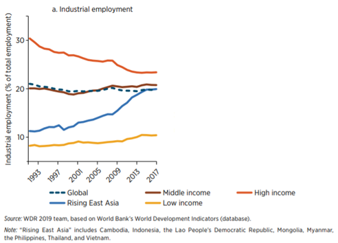
1. Criteria 7: Frequency polygon
The frequency polygon is the graphical representation of frequencies of each variable, where the graph is used to depict the shape of the statistical data. From the above graphs, it can be deduced that the industrial employment on the high-income level is decreasing, whereas on the global level it is uniform. The x-axis of the graph shows the timeline from 1993 to 2017 and y-axis shows the industrial employment as the percentage of total employment. The graph shows the change or fluctuation in the industrial employment over time, and the variables in the graphs are a timeline. With the change in the global level, the fluctuations in the middle income, low income and high-income group are also revealed.
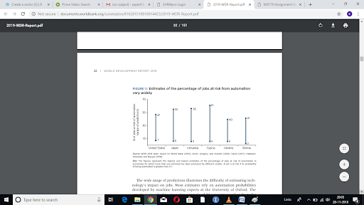
2. Criteria 9: Minimum and maximum value chart
The minimum and maximum value chart is a graphical representation of the minimum and the maximum value of different variables in one chart. According to the above diagram, the minimum and maximum percentage of the jobs at risk due to automation is presented. The minimum and maximum percentage or the range of jobs at risk due to automation are represented in differed countries, such as United States, Japan, Lithuania, Cyprus, Ukraine and Bolivia. The minimum and maximum value chart is appropriate for this statistical data, as it clearly defines the minimum, the maximum and range of the percentage of jobs at risk of automation.
3. Criteria 13: 100% stacked bar graph
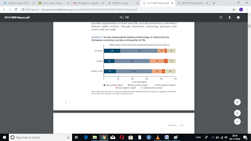
The 100% stacked bar chart is a type of stacked bar chart, where the categorization of the data of the variables, will be done based on the relative frequency or percentage of each category. The above chart showcases that data collected from the survey regarding the improvement due to technology in the economy, society and quality of life. The 100% stacked bar graph also shows that from 100% respondents, some percentage of responders responded that the impact of the technology is either very positive or fairly positive or fairly negative or very negative or it depends.
4. Criteria 3: Bar graph
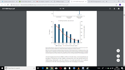
The data in a bar graph is represented in rectangular bars, where the frequency of each variable is defined by the height and breadth of the rectangle is equal and defines the variable. The Bar graph can be vertical or horizontal. According to the above graph, it represents the time and cost to start a new business over time. The above graph is the combination of the line graph and bar graph. In the graph, the x-axis represents the timeline, from 2005 to 2017, whereas the y-axis on left shows the number of days to start a business and y-axis on right showcases the cost as the percentage of income per capita. The graph shows that over time, the time and the cost to start a business has decreased.
5. Criteria 6: Stacked Bar chart
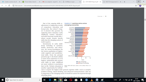
The stacked bar chart is used to break the data and compare it as a whole. Each bar represents a single variable and each division of the bar represents the different category. The above graph shows the years of learning and year of schooling in different countries. The x-axis shows the number of years and the y-axis shows the number of countries. The graph also depicts the difference in the years of learning and year of schooling in different countries. In addition to this, the stacked bar chart is appropriate to represent this type of data, to showcase the difference in countries and also a difference in years of learning and years of schooling.
6. Criteria 12: Dot plot
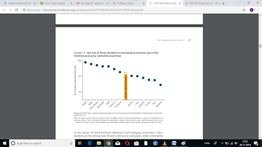
A dot plot is the graphical representation of the univariate data, where the variables are shown on x-axis and frequencies are shown on the y-axis. The dot plot in the above graph showcases the univariate data of percentage of employees employed informally. The graph also showcases the name of countries on x-axis and percentage of employees employed informally on the y-axis. Each country has a percentage of informally employed employees and the dot plot showcase the percentage in each country. The dot plot also assists in assessing the variations in different countries and its comparison with the total average of informally employed employees.
7. Criteria 5: Clustered Bar chart
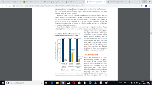
Clustered bar chart showcases more than one data series in vertical rectangles. Each data series is demonstrated on same axis labels and vertical bars are grouped based on categories. The above graph showcases the difference in the platform firm and offline competitor when assessed on the basis of the size of the business. The above graph has three different variables, number of branches, rooms and number of drivers with two categories each, platform firm and offline competitor. For this type of data, the clustered bar graph was appropriate with 3 variables, 2 categories and with platforms and relative size of their offline competitors on the y-axis.
8. Criteria 11: Scatterplot
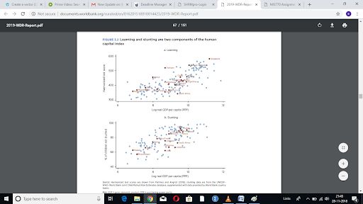
Scatter plot defines the correlation between the two variables, which is present on x-axis and y-axis. The pattern of the scatter plot defines the relationship between the two variables. The scatter plot in the above graph shows the relationship between the log real GDP per capita and the percentage of children not stunted. The scatter plot shows that the relationship among both the variables is positive and each plot in the graph shows the GDP of each country with the percentage of children not stunted. To depict the relationship among both the variables, the scatter plot is selected which is also appropriate selection.
9. Criteria 10: Multiple summary tables:
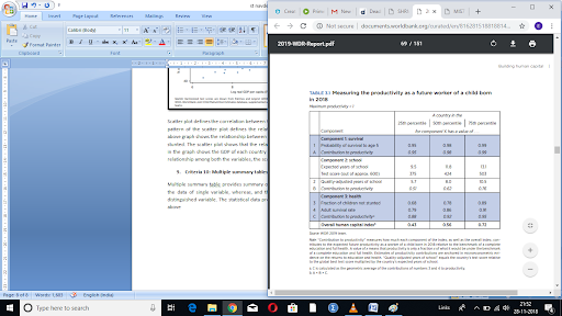
Multiple summary tables provide a summary of the statistical data in table format, where the rows define the data of a single variable, whereas, and the column defines the frequency or percentage of each distinguished variable. The statistical data presented in this type of table is of multiple variables. In the above table from the report, the data shows the productivity of the future worker with the birth of a child. The table summarizes the data on survival, school and health to decide the productivity of the future worker. The overall human capital index has been calculated as the multiplication of A, B and C. The data is also divided into countries with different percentile. The multiple summary tables are the appropriate table for the data, as it summarises the overall human capital index for a country with 25th percentile, 50th percentile and 75th percentile.
10. Criteria 1: Single Summary table
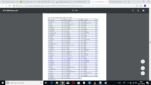
The single summary table provides the summary of the statistical data in table format, where the rows define the data of single variable, whereas, and the column defines the frequency or percentage of each distinguished variable. The statistical data presented in this type of table is of the single variable. The above table shows the univariate date on the human capital index of different countries, according to which their rank is decided. The row defines the data in each country, whereas the column in the table shows the rank, the name of the country and human capital index of each country.
Get It Done! Today
1,212,718Orders
4.9/5Rating
5,063Experts

Highlights
- 21 Step Quality Check
- 2000+ Ph.D Experts
- Live Expert Sessions
- Dedicated App
- Earn while you Learn with us
- Confidentiality Agreement
- Money Back Guarantee
- Customer Feedback
Just Pay for your Assignment
Turnitin Report
$10.00Proofreading and Editing
$9.00Per PageConsultation with Expert
$35.00Per HourLive Session 1-on-1
$40.00Per 30 min.Quality Check
$25.00Total
Free- Let's Start


